
Hyperion Sensors

Brand and product design for Hyperion Sensors’ tFit platform, a fibre-optic sensing solution developed for the electric utility sector. The engagement began with identity, product faceplates and an extensive suite of collateral for international trade shows, then moved considerably deeper into the product itself: designing the GUI and user experience for the tFit Sensor Suite desktop application. From the box to the interface, with quite a bit of fibre in between.


  • The Product

    tFit Sensor Suite

  • My Role

    Branding + UI / UX

  • The Work

    Identity + Product + Digital

  • From Physical To Digital

    Faceplates → Interface

MAKING SENSE OF THE SIGNAL // tFI SENSOR SUITE / UX + UI

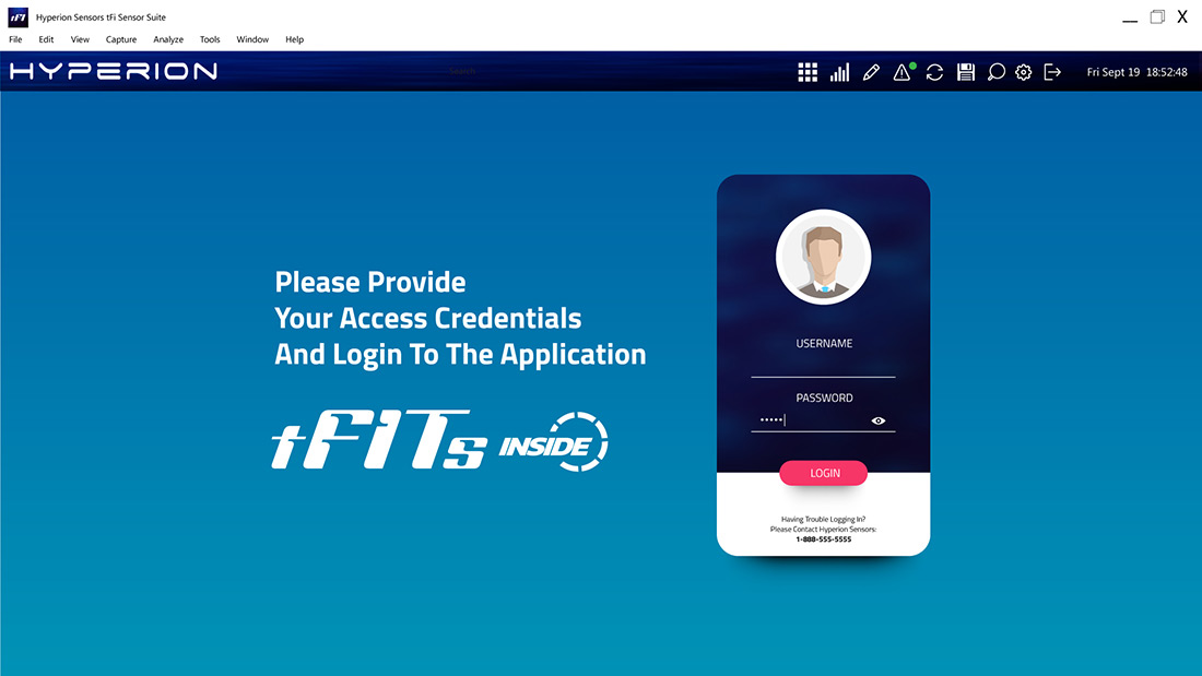
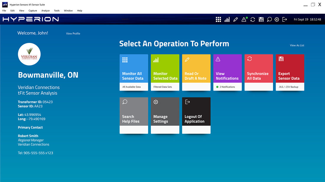
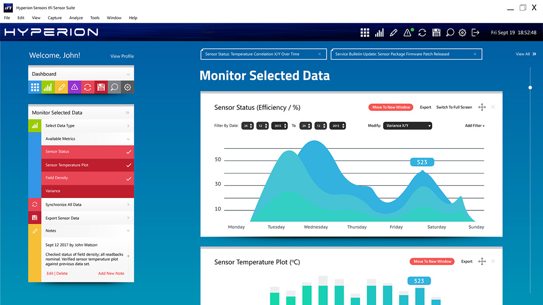
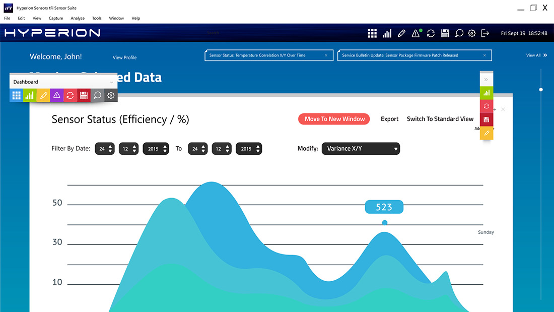
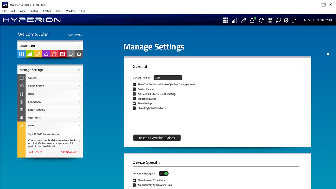
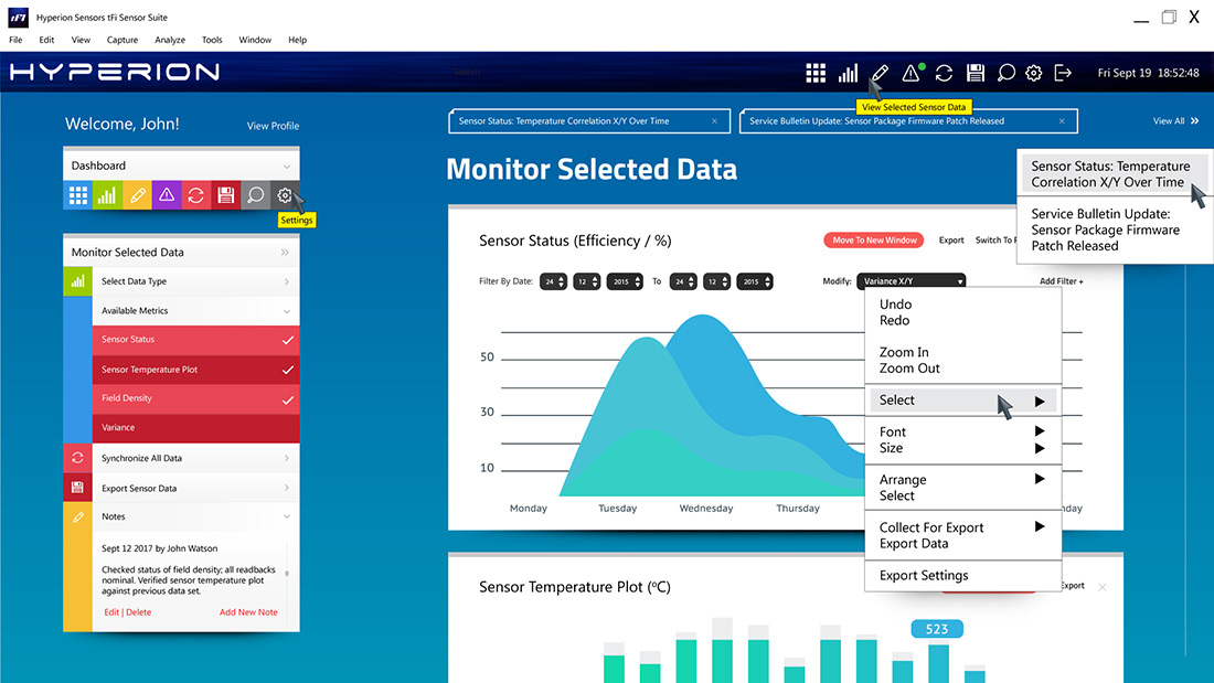
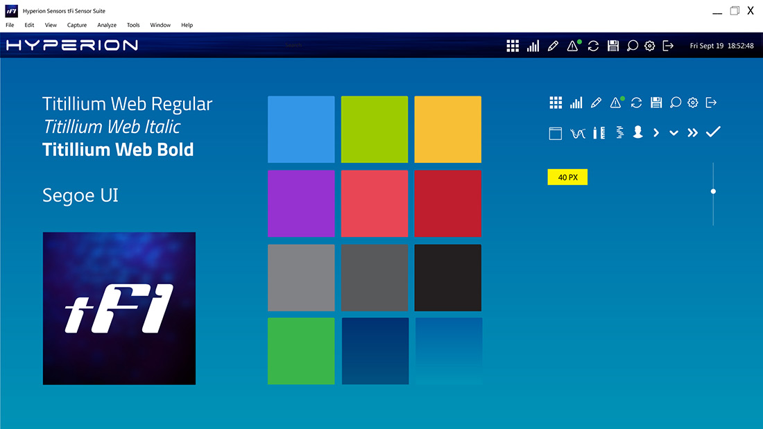
Eight prototype screens developed for the tFit Sensor Suite desktop application, exploring the interface, information hierarchy and user experience required to make complex sensor data considerably easier to navigate, understand and act upon.

BUILT TO STAND OUT // TRADE SHOW + DISPLAY GRAPHICS

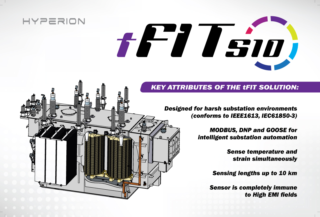
Designed to take the tFit identity into the physical world, these 10′ × 8′ and 4′ x 8′ trade show displays translated a highly technical product into a clear, immediate visual presence built for a considerably busier room.

Meanwhile, Elsewhere...

THE MOMENT OF CONTACT

Questions?
Comments?
Kudos?
A New Project?

Have a project, an idea, a question, or an interesting problem that refuses to behave? Something that needs making, fixing, rethinking, photographing, designing, or otherwise coalescing into existence? Make contact. I can’t promise to say yes, but I can promise to have an opinion.

Back